Css Flex Box

Flex is used to align the elements with operation rows and columns.There are some attributes name as justify-content, align-items, flex-direction, order, align-self, flex-wrap,align-content.
Properties of Flex:
Display:
It defines to the webpage as inline box.
code:
.container{
    background-color: #383838;
    display: flex; }
.value{
    height: 50px;
    width: 50px;
    background-color: red;
    border: 2px solid yellow;

}
 html
<div class="container">
        <div class="value">1</div>
        <div class="value">2</div>
        <div class="value">3</div>
        <div class="value">4</div>
        <div class="value">5</div>
    </div>
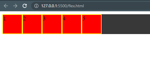
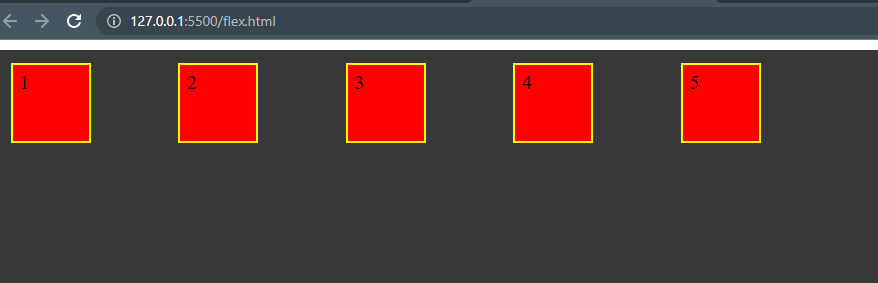
Result:
The column box wil align to the inline and flex only works at the rows.
Flex-Direction:
It is define the alignement of the boxes using row,row-reverse,column,column-reverse these attributes.
code:
.container{
    background-color: #383838;
    display: flex;
    flex-direction: column;
    flex-direction: column-reverse;
    flex-direction: row-reverse;
    flex-direction: row;
}
Result:
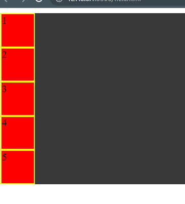
flex-direction: column for this the all boxes are align as column.
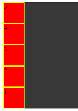
flex-direction: column-reverse for this all boxes are align as reverse column.
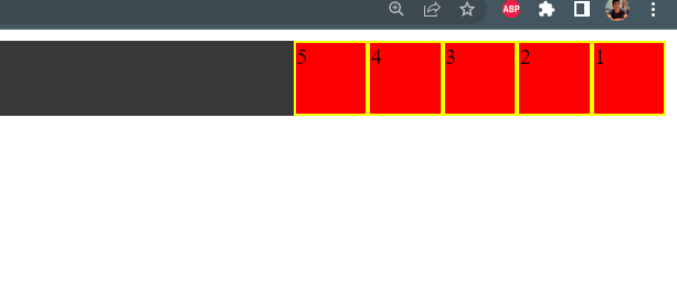
flex-direction: rowfor this all boxes are agline as row.
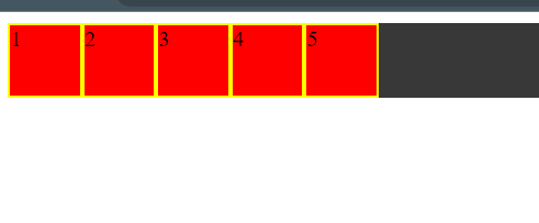
flex-direction: row-reverse for this all boxes are display as the
Flex-wrap:
This flex attribute link with all items with in a container and nowrap, wrap, wrap-reverse using these property we can align the flax items.
code:
.container{
    background-color: #383838;
    height: 500px;
    display: flex;
    flex-wrap: nowrap;
    flex-wrap: wrap;
    flex-wrap: wrap-reverse;


}

Html:
 <div class="container">
        <div class="value first">1</div>
        <div class="value second">2</div>
        <div class="value thrid">3</div>
        <div class="value fourth">4</div>
        <div class="value fifth">5</div>
        <div class="value">1</div>
        <div class="value">2</div>
        <div class="value">3</div>
        <div class="value">4</div>
        <div class="value">5</div>

    </div>
Result:
flex-wrap: nowrap it wrap up the whole items within one row.
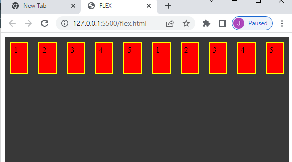
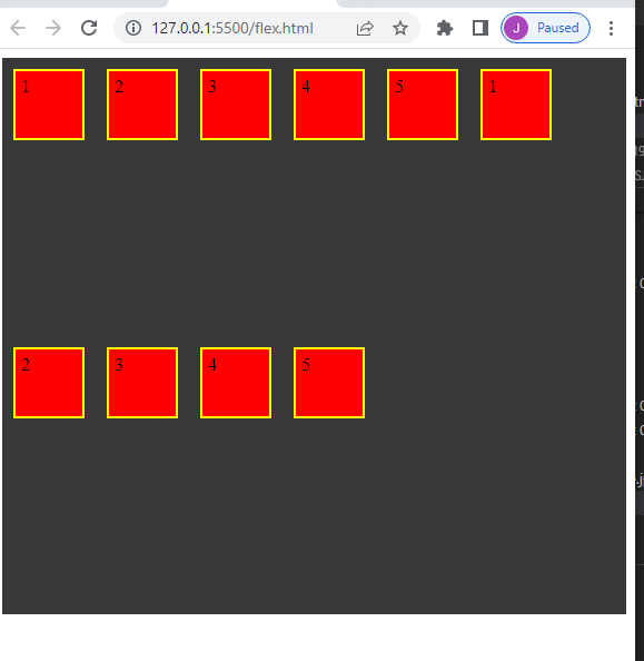
flex-wrap: wrap it adjust with the width of the browser and wrap the items.
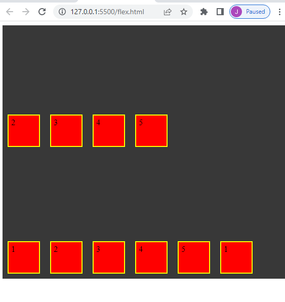
flex-wrap: wrap-reverse it populate at the end of the web page as reverse align
Justify-content:
This attributie is used on element that are on row in the webpage. It is deal with row oparation.
Code:
.container{
    background-color: #383838;
    display: flex;
    justify-content: flex-start;
    justify-content: flex-end;
    justify-content: center;
    justify-content: space-around;
    justify-content: space-between;
    justify-content: space-evenly;
}
Result:
justify-content: flex-start start at first of webpage.
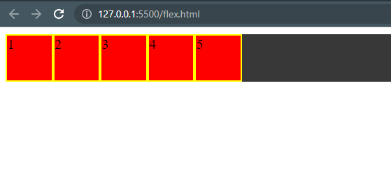
justify-content: flex-end it start with the boxes at the end of the column

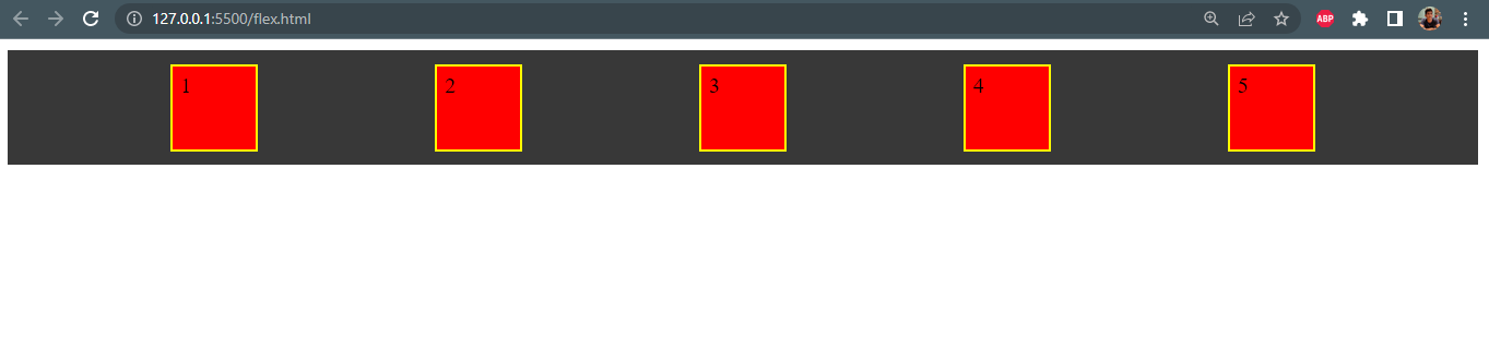
justify-content: center it align the element at center of the policy.

justify-content: space-around it is given equaly space to left and right side of the boxes.

justify-content: space-between; it is give space only two boxes side by side.
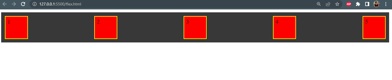
justify-content: space-evenly; it is evenly space between left and right side of boxes.
Align-itmes:
It is workaround in cloumn side.The atttributes are flex-start, flex-end, center ect.
code:
.container{
    background-color: #383838;
    height: 500px;
    display: flex;
    align-items: flex-start;
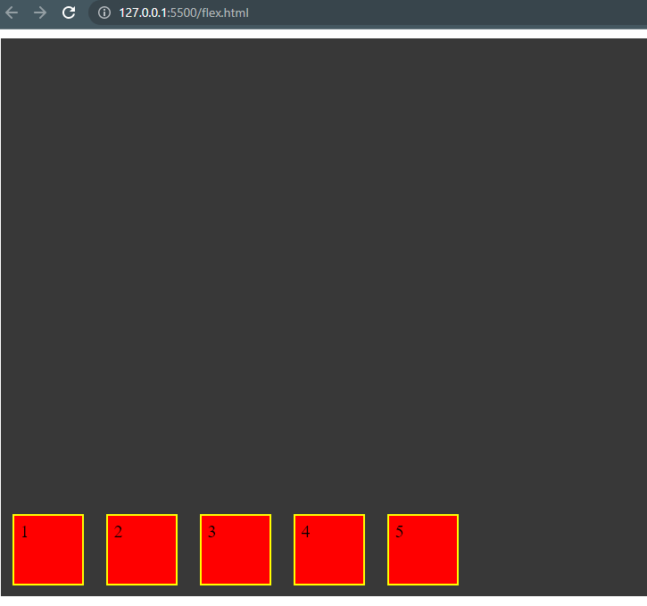
    align-items: flex-end;
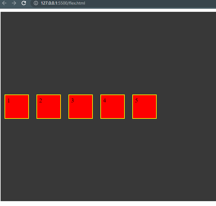
    align-items: center;
}
Result:
align-items: flex-start it is align to top.
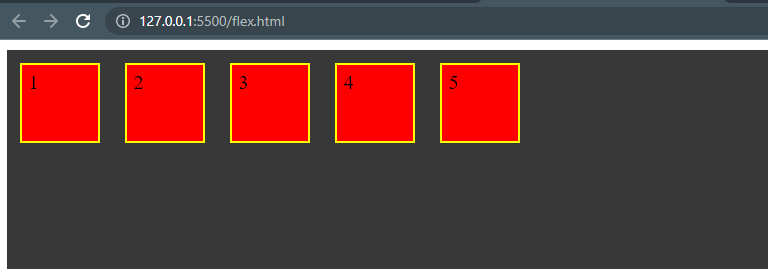
align-items: center it is align to middle of the container.
align-items: flex-end it is align to end of the container.
Gap:
It is used for giving gap between to boxes. gap,row-gap,column-gap these are present in gap.
code:
.container{
    background-color: #383838;
    height: 500px;
    display: flex;
    flex-direction: column;
    gap: 30px;
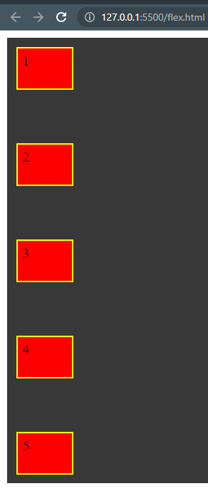
    row-gap: 80px;
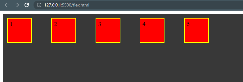
    column-gap: 40px;
}
Result:
gap it is giving a gap between two box.
row-gap it is row gap between boxes.
column-gapit is column gap between boxes.
Order:
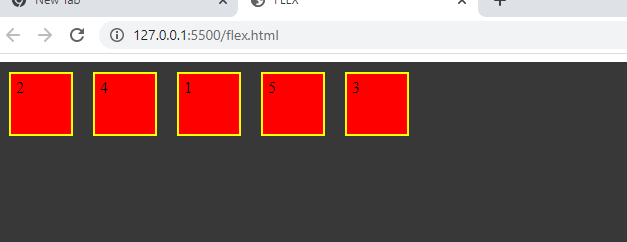
Flex items are set as acending order by defalut. Using Order we can place the items rearange the items.
code:
.first{
    order: 3;
}
.second{
    order: 1;
}
.thrid{
    order: 5;
}
.fourth{
    order: 2;
}
.fifth{
    order: 4;
}

Html:

 <div class="value first">1</div>
        <div class="value second">2</div>
        <div class="value thrid">3</div>
        <div class="value fourth">4</div>
        <div class="value fifth">5</div>
Result:
As we see that the "1 " set using order to third position and other as define in css.
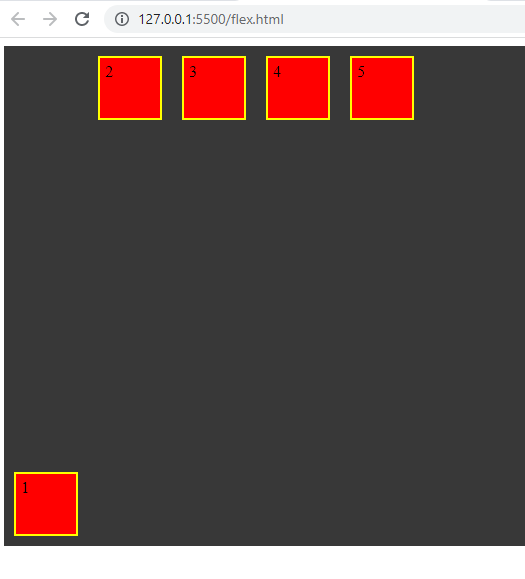
Align-self:
It is target any flex itmes and oparate column wise.flex-start,flex-end, center, stretch attributes are used.
code:
.first{
    align-self: flex-start;
    align-self: center;
    align-self: flex-end;
    align-self: stretch;
}
Result:
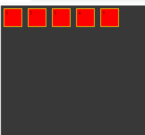
align-self: flex-startAs a result target the "1" box which set as position of start.
align-self: center it set as center of the container.
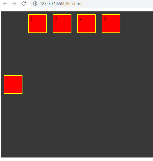
align-self: flex-end it set as the end of the container.
Align-content:


