


Gird is a layout design of a webpage.It is two dimensional grid-based layout system.It works both column and rows.
The attributes are grid-template-columns,grid-template-rows,grid-column-start
grid-column-end
grid-row-start
grid-row-end use to grid layout.
grid-template-columns,grid-template-rows:
These are define the columns and rows starting and ending position.
syntax:
 grid-template-columns:<size>;
 grid-template-rows:<size>;
code:
.container{
display: grid;
height: 100vh;
width: 1000vr;
background-color: #808080;
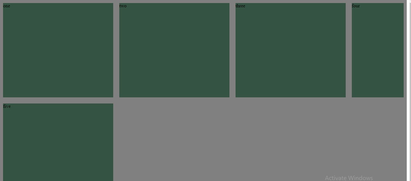
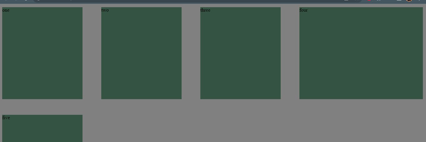
grid-template-columns: 2fr 2fr 2fr 1fr;
grid-template-rows: 2fr 2fr 3fr 4fr ;
}
.item{
margin: 10px;
background-color: #345343;
}
HTML:
<div class="container">
<div class="item itemq">one</div>
<div class="item">two</div>
<div class="item">three</div>
<div class="item">four</div>
<div class="item">five</div>
</div>
Result:
Fr is a fractional unit and 1fr is for 1 part of the available space.
For grid-template-columns:
grid-template-rows:
There is grid porperty repeat(), it is very efficent to use and useful.
Syntax: repeat(<no of part of the width >, <size>)
Code:
.container{
display: grid;
height: 100vh;
width: 1000vr;
background-color: #808080;
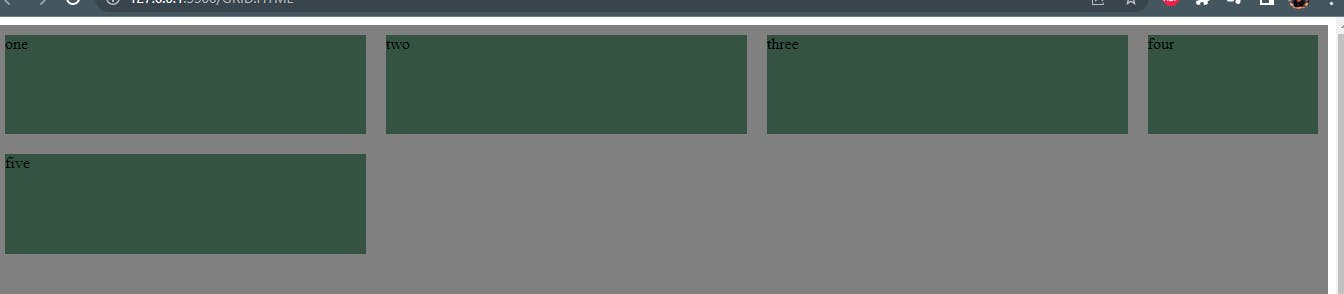
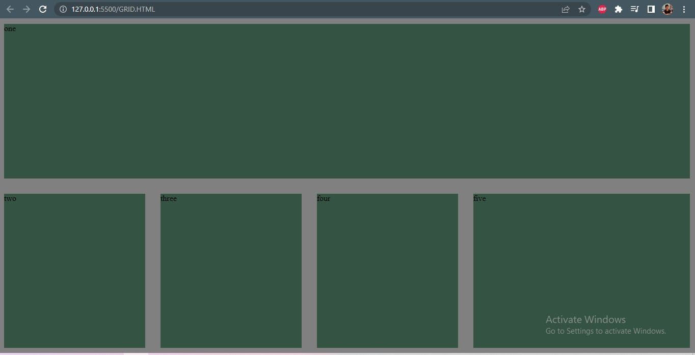
grid-template-columns: repeat(3 ,2fr);
grid-template-columns: repeat(2 ,3fr 1fr);
Result: As a result of repeat(3, 2fr) the whole webpage width is part into 3 parts and all items are same width with 2fr.
and other repeat(2 ,3fr 1fr); the whole page is divided into 2 parts and the items are also divided into 2 parts with width 3fr and 1 fr.
Row-gap,Column-gap:
It gives spaces bewteen the itmes of the webpage.
Code:
.container{
display: grid;
height: 100vh;
width: 1000vr;
background-color: #808080;
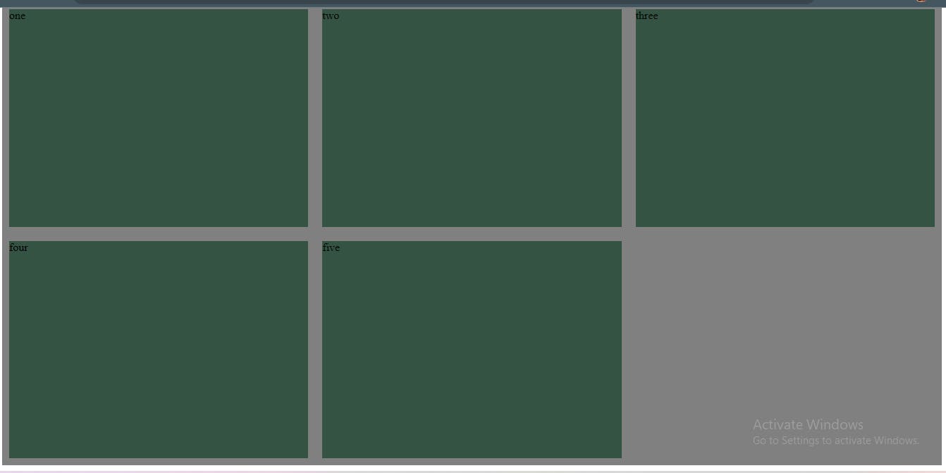
grid-template-columns: 2fr 2fr 2fr 3fr ;
row-gap: 30px;
column-gap: 40px;
}
Result:
As result the gap bewteen row and column as 30px and 40px.
grid-column-start grid-column-end grid-row-start grid-row-end:
Using these attributes merge columns and rows of webpage items.
Code:
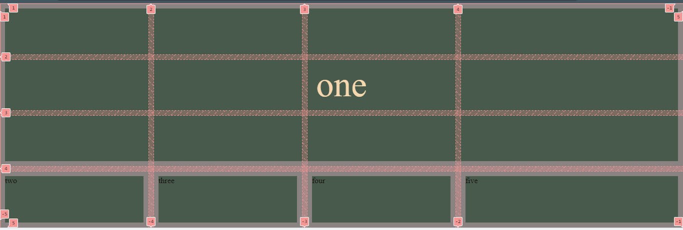
.item1{
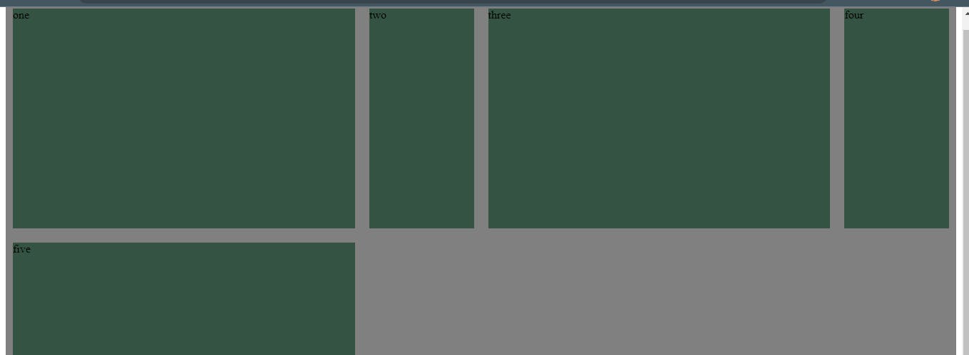
grid-column-start: 1;
grid-column-end: 5;
}
Result: As a result the whole page 1st row is fill.
for row -
Code:
```css .item1{ display: grid; align-items: center; color: wheat; font-size: 70px; grid-column-start: 1; grid-column-end: 5;
grid-row-start: 1; grid-row-end: 4;
}
Result: For the gird row is started at 1 index and end to 5 index so in result, the 'one' is placed middle and the porperty is down.
Thank you for reading the blog!!!!